Bringing REITScreener's Mobile-Friendly Website and App for Enhanced User Engagement
REITScreener is an innovative platform for investors in the Real Estate Investment Trust (REIT) market. The service offers insightful analysis, up-to-date information, and comprehensive tools to facilitate informed investment decisions in the REIT sector.
Bringing REITScreener's Mobile-Friendly Website and App for Enhanced User Engagement
Project overview
SaaS
REITs App
Finance
Deliverables
Create breakpoints for the website and web app
Design mock-ups for additional website pages
Role
UI Design
Visual support


TL;DR
This project focuses on enhancing the responsiveness of REITScreener's website and web application for mobile users.
It shows the discovery phase, including the creation of:
Wireframe screens
Mock-ups for mobile breakpoints
SEO-optimized meta images
This case study details our approach taken to ensure a seamless and efficient user experience across multiple platforms, particularly for mobile users.
REITScreener is an innovative platform for investors in the Real Estate Investment Trust (REIT) market. The service offers insightful analysis, up-to-date information, and comprehensive tools to facilitate informed investment decisions in the REIT sector.
Discovery and ideation
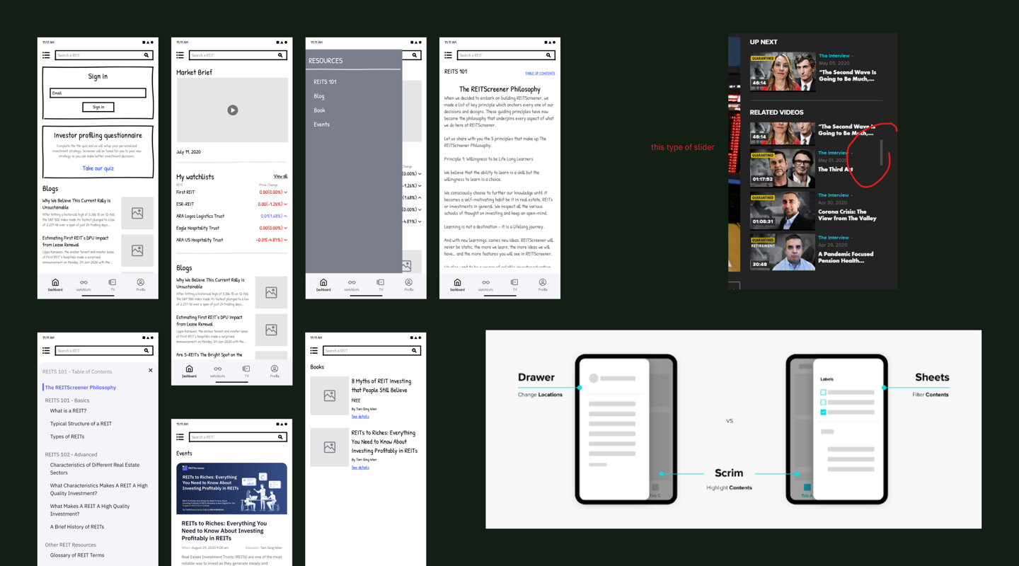
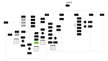
The discovery and ideation phase involved initial wireframing and sketching, crucial for laying the groundwork for the app's design and structure.
This stage allowed for the exploration of different layouts and functionalities, ensuring a user-centric design approach. Additionally, a thorough product teardown of similar apps and competitors was conducted. This analysis provided valuable insights into industry standards, innovative features, and potential areas for differentiation.
Finally, research on effective breakdown was undertaken, focusing on how information and features could be optimally organized for user convenience and engagement.
This phase was instrumental in setting a solid foundation for the subsequent design and development stages.

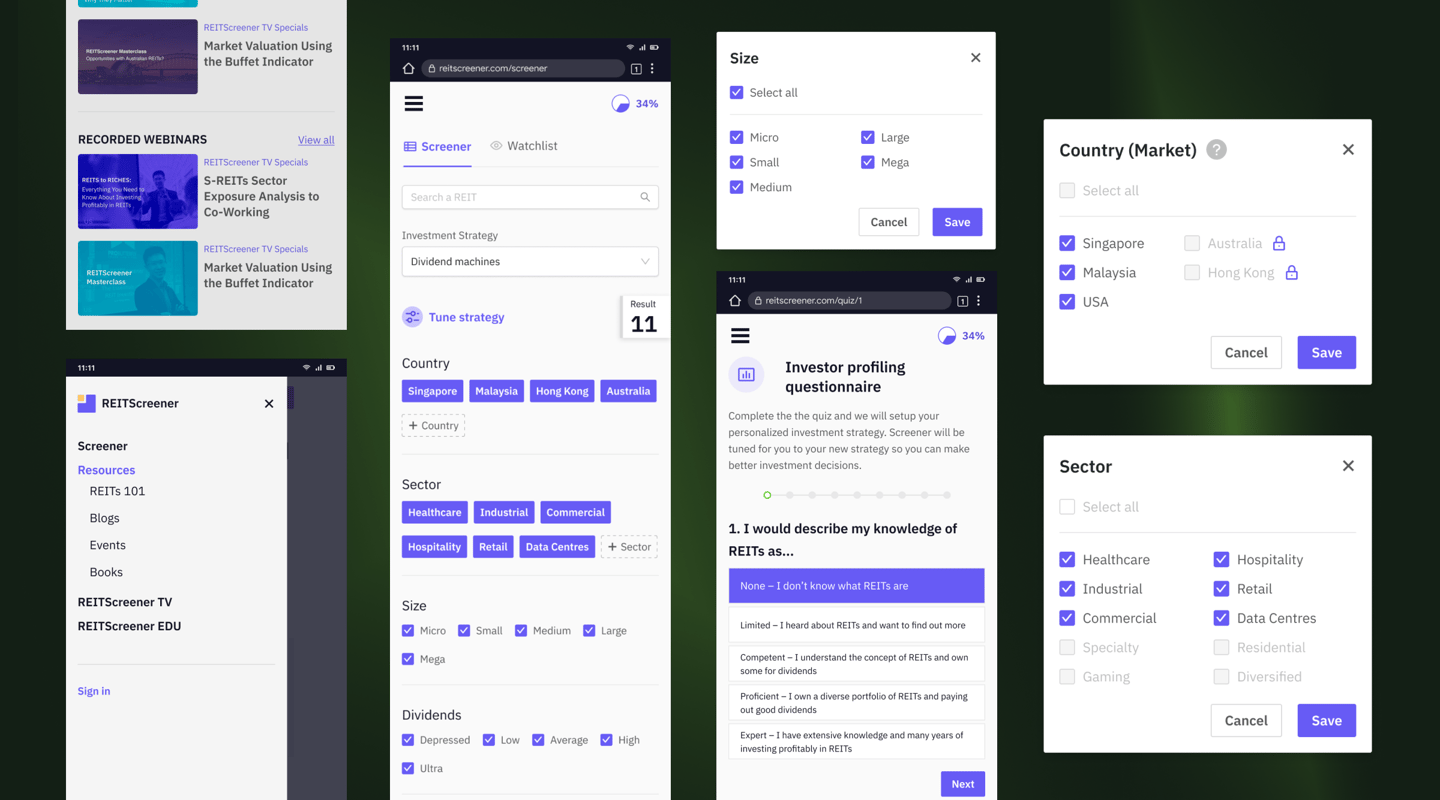
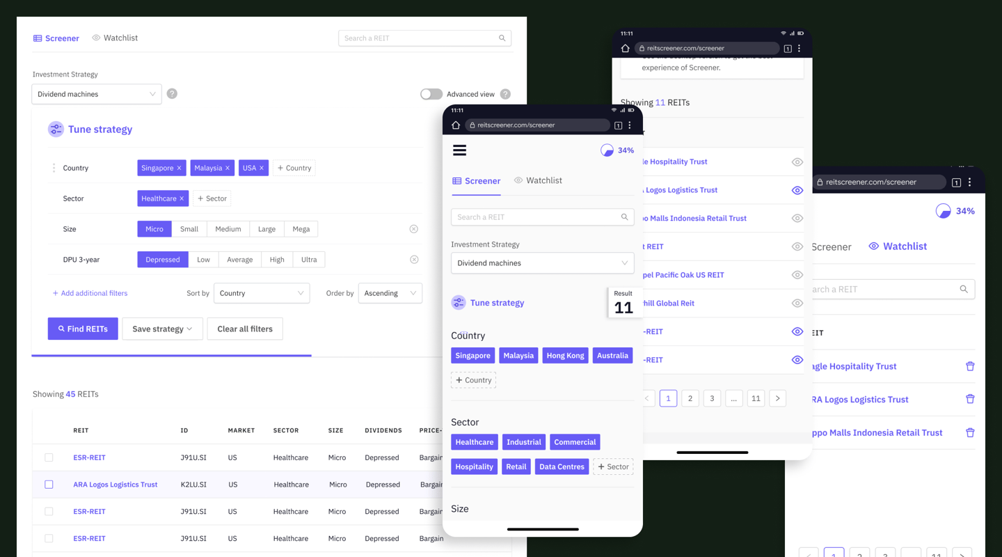
Screener page
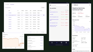
One of the most challenging breakpoint designs I did for this project was converting web table view into mobile.
Challenge: Data Density
The screener page contains tables with extensive information, including numerous columns and rows filled with numbers and graphs. On mobile devices, this density can overwhelm the screen.
Solution: Implementing a responsive table design that allows users to swipe horizontally to view additional data. Reduce to only the most important REIT data shown specifically for mobile.
Challenge: Readability of Numbers and Graphs
Ensuring that numerical data and graphs are legible on smaller screens is crucial.
Solution: Use scalable vector graphics (SVGs) for graphs to maintain clarity at any size. For numerical data, consider a larger font size and sufficient spacing to enhance readability.
Challenge: User Interaction with Data
Interacting with data-heavy tables on a small screen can be cumbersome, particularly when it comes to selecting and manipulating data points.
Solution: Implementing touch-friendly components, such as larger touchpoints for selection.
Challenge: Information Hierarchy
On smaller screens, prioritizing what information is immediately visible is essential.
Solution: Adopt a collapsible and expandable interface design that allows users to tap and reveal more information as needed. This approach maintains a clean initial view while providing access to detailed data on demand.
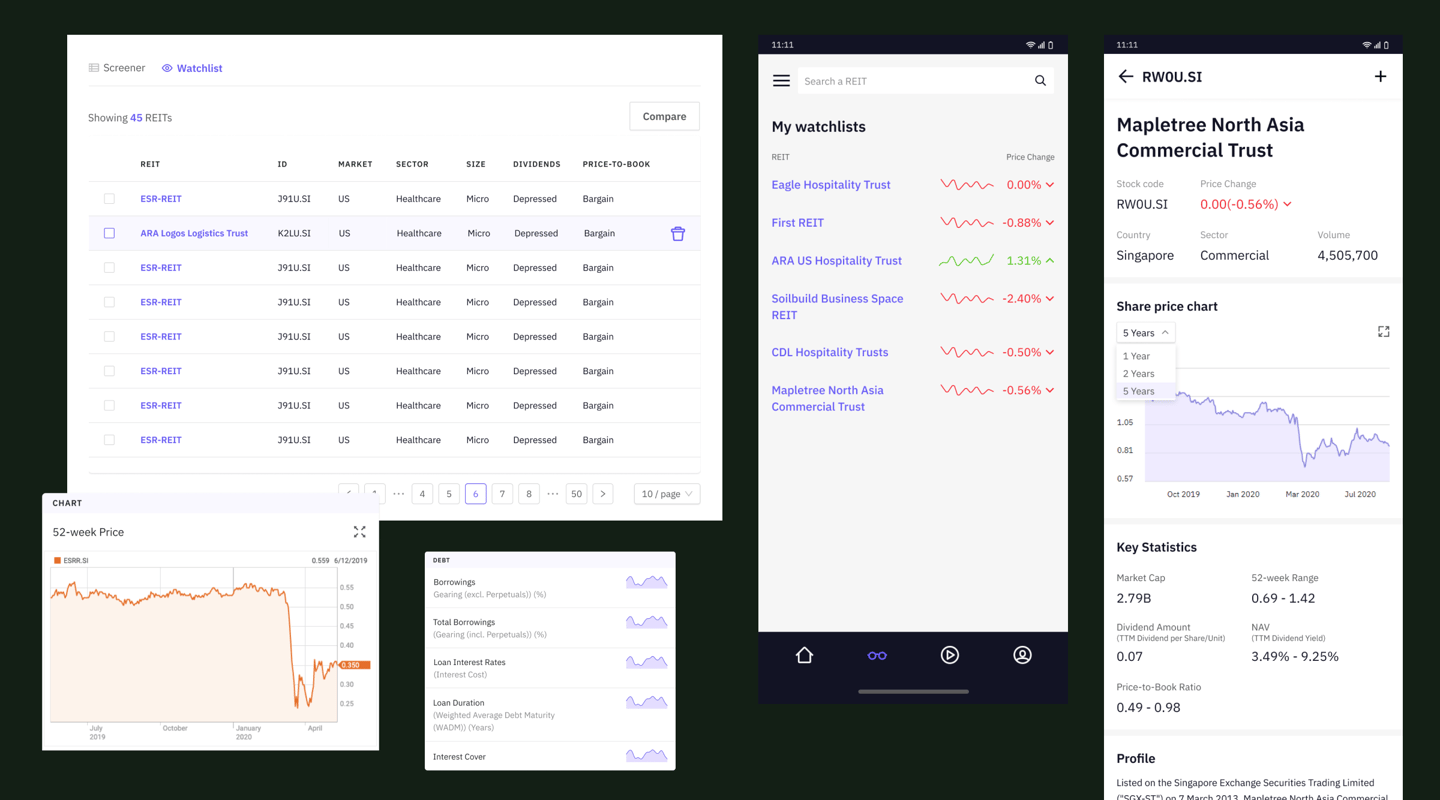
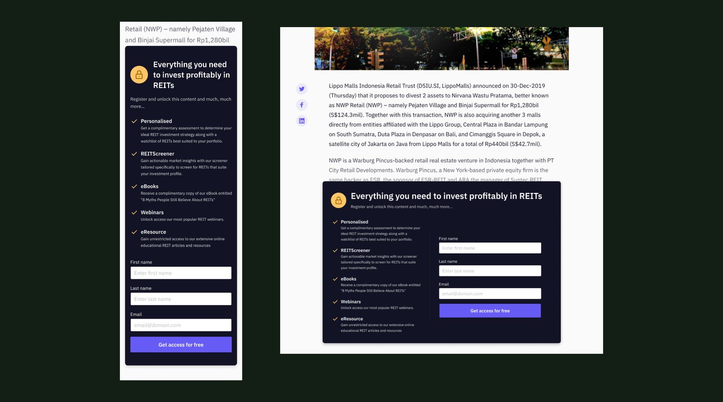
Website mock-up
I've created new designs for additional websites, making sure they work well on smaller screens like phones and tablets.
I've also focused on making sure that the transition from design to actual website building is smooth and easy for developers. This helps in turning the designs into functioning websites without any problems.

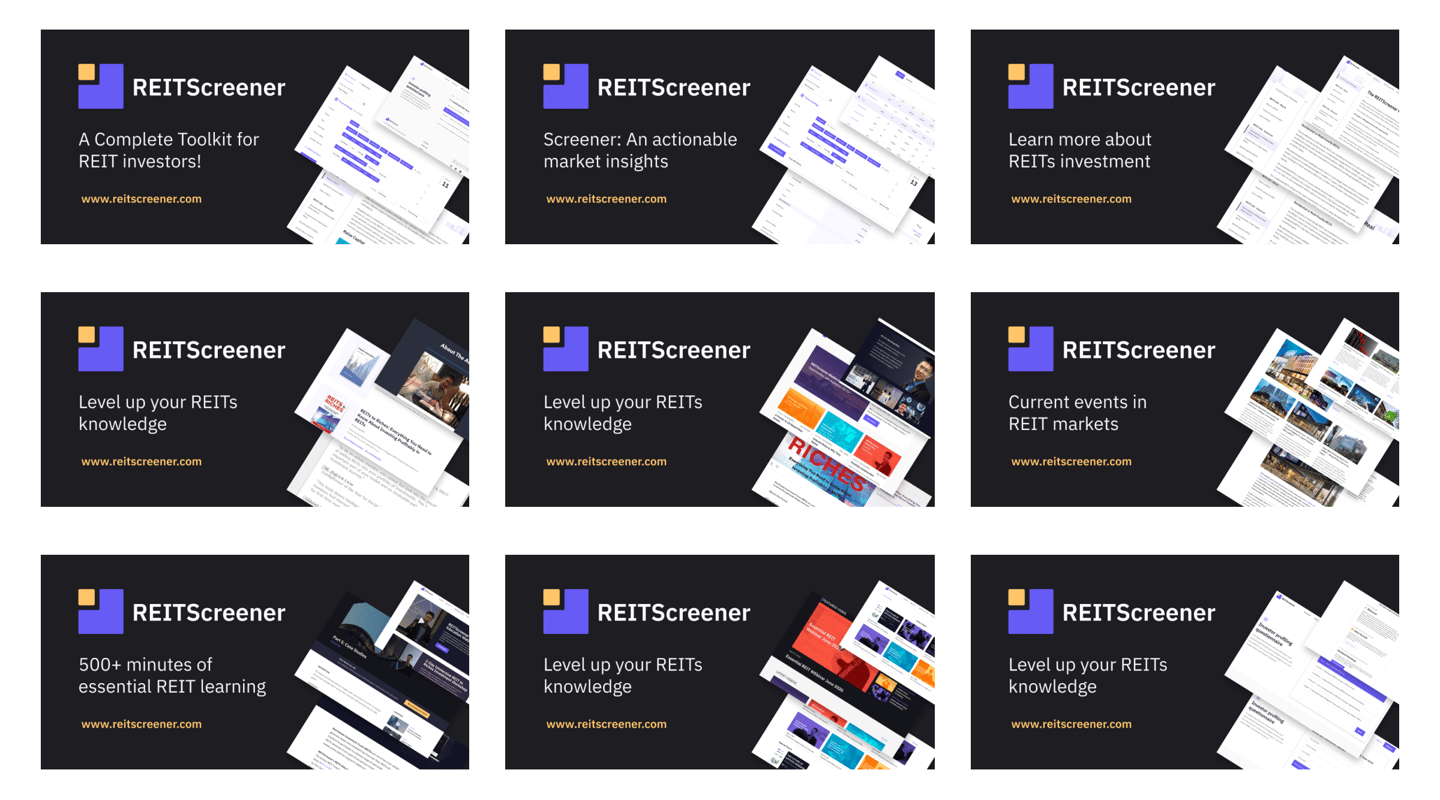
SEO meta image
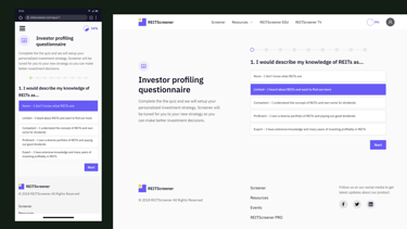
This image is chosen to quickly grab attention and convey the essence of the page's content. It's particularly important because it can influence click-through rates; a compelling image can encourage more people to click on the link.
Please note: In compliance with the Non-Disclosure Agreement terms set forth by the company, I am limited to displaying only selected screens from this project. Confidentiality and adherence to the NDA terms are strictly maintained.
Feel free to reach out!
I am available for a FREE online 1-1 mentorship.
Go to www.adplist.org/mentors/estella to book a 30-minute session with me.
I am also open to event speaking engagements with the following topics:
UX Design
Typography
Design System
Design Management
Brand Identity Design
Career Progression in Design
Women Empowerment topics
Inquire about speaking availability by sending me a message on LinkedIn.
