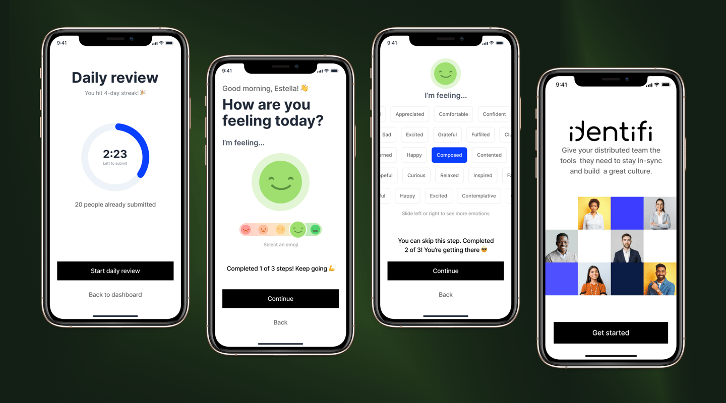
Identifi’s Daily Review feature mobile app
Identifi is an innovative in-house collaboration tool designed to streamline team interactions, track employee sentiment, and celebrate individual contributions aligned with our core values. It stands as a testament to our commitment to fostering a positive and productive work environment.
Identifi’s Daily Review feature mobile app
Project overview
SaaS
Mobile App
Feature-focused
Deliverables
Gamifying the app's daily user task
Improve visual designs
Nudge users to submit daily check-ins at a specified time
Minimize steps to submit check-in
Role
UX & Visual design
Conducting usability test sessions
Presenting to stakeholders


TL;DR
In this project showcase, I’d be showing you the following:
Usability test, its process, and finding summary
Product teardowns as part of product research
Challenges and solutions statements
User journey mapping
Mock-ups
Identifi is an innovative in-house collaboration tool designed to streamline team interactions, track employee sentiment, and celebrate individual contributions aligned with our core values. It stands as a testament to our commitment to fostering a positive and productive work environment.
Usability Test
Optimized User Accessibility for Check-in Pages
The objective is to ensure that users can effortlessly access and navigate the check-in pages.
Metrics: Track metrics such as page load times, ease of navigation, and user feedback to assess accessibility.
Outcome: Aim for a high level of user satisfaction regarding the ease of accessing and reading content on the check-in pages.

Effective User Engagement through Morning Review Triggers
Objective: Determine if the Morning Review feature actively encourages daily user engagement.
Approach: Utilize engagement metrics like daily active users, interaction rates, and time spent on the Morning Review section.
Outcome: Achieve a noticeable increase in daily user interactions, demonstrating that the Morning Review effectively initiates and sustains user engagement.
Target users
New hires
Managers
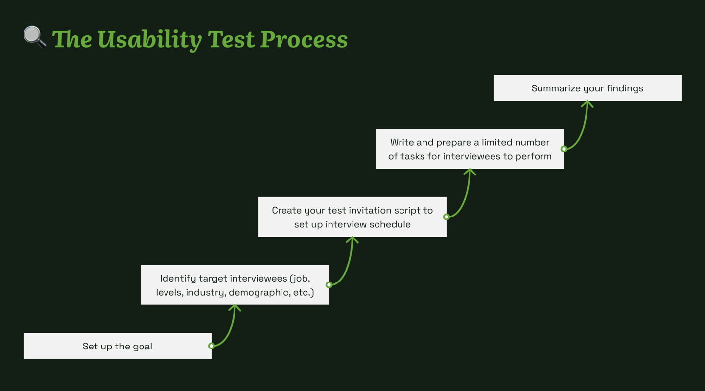
I am aware how usability test activities can get easily complicated. If not careful, the activities can also be a dreading experience for your interviewees and of course, as designers, we don’t want that to happen.
So I’ve created my own simplified version of the test (after thorough research). Since this is an MVP feature that we we want to add to an existing product, I want to have a simpler easy-to-manage, reusable usability test process.
And here’s how it goes...
Findings
We have conducted a usability test within the organization to know how we can better improve the daily check-in and nudge our company employees to submit it daily. These are some insights I got from our interviewee.
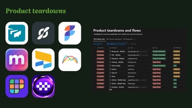
Note: I can only show a few summary results because the project's overall research cannot be divulged publicly.
Q: How often do you visit the check-in page?
A: Early in the morning when submitting. It has been a routine.
A: I really don't visit it that often. I only use Slack. (we have Slack integration of the app)
A: Not visiting → Only submit check-in because I have no direct report so I don't have the motivation to send it.
Q: Does the check-in page on mobile will give you convenience?
A: Depends on the usage. I can browse easily on mobile. The web is more convenient for submissions. Mobile will be for viewing purposes.
A: Yes. It's usually the most used. Especially since I can browse it conveniently upon waking up.
Q: Is it easier for you to find the check-in page?
Yes it is easy to find
No. Would be nice to have it in the bottom app bar
The side panel is not obvious so it is hard to find I assume I can scroll through the dashboard to find it
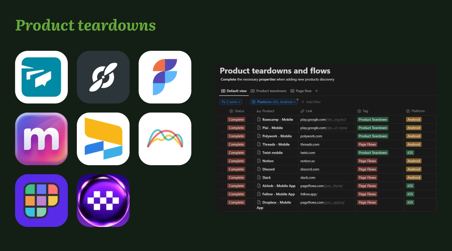
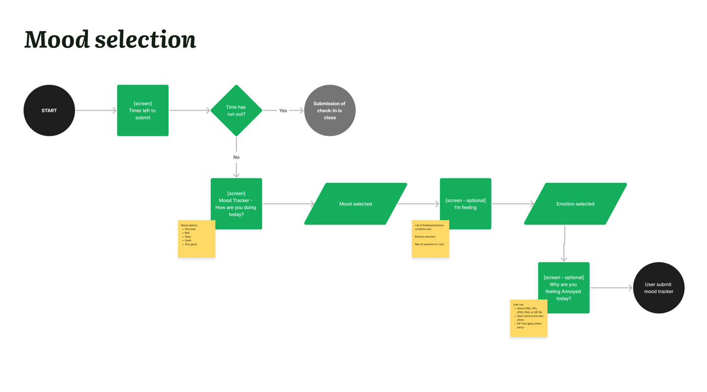
Product teardowns
Product teardowns are an in-depth analysis process where a product is systematically disassembled to uncover its components, design, functionality, and manufacturing methods.
This process extends beyond mere competitor analysis, delving into the nuances of a product's construction and operation.
Challenge
Nudging users to submit their check-ins on a daily basis highlighted the most based from our interviews.
Solutions
Immediate Check-In Access: Ensure the check-in feature is readily accessible right from the app's launch.
Enhanced Visual Engagement: Utilize captivating visuals to engage users more effectively.
Simplified Interaction: Implement a one-tap selection process per screen for user options.
Streamlined Decision-Making: Reduce the number of decisions users need to make on each screen, facilitating a smoother user experience.
User journey mapping
When creating a user journey map, it gets overwhelming so easily that a possibility of stakeholders and team members would not want to check on it.
We’ve come up with a solution to breakdown each part of the feature into smaller maps for it to be traceable and easy to digest.
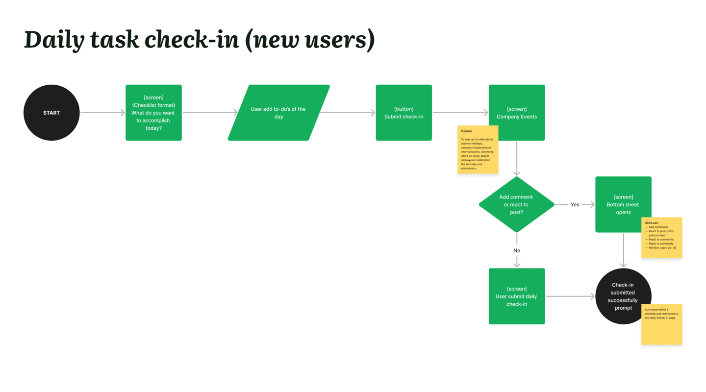

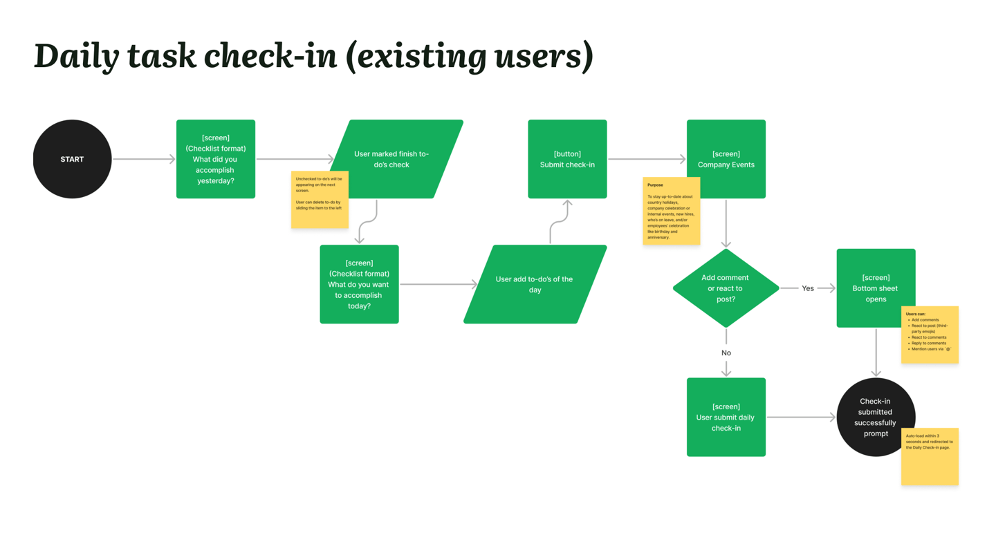
In addition to the mood selection screens
The overall feature includes
Mood selection
Check-in of daily tasks
Company events


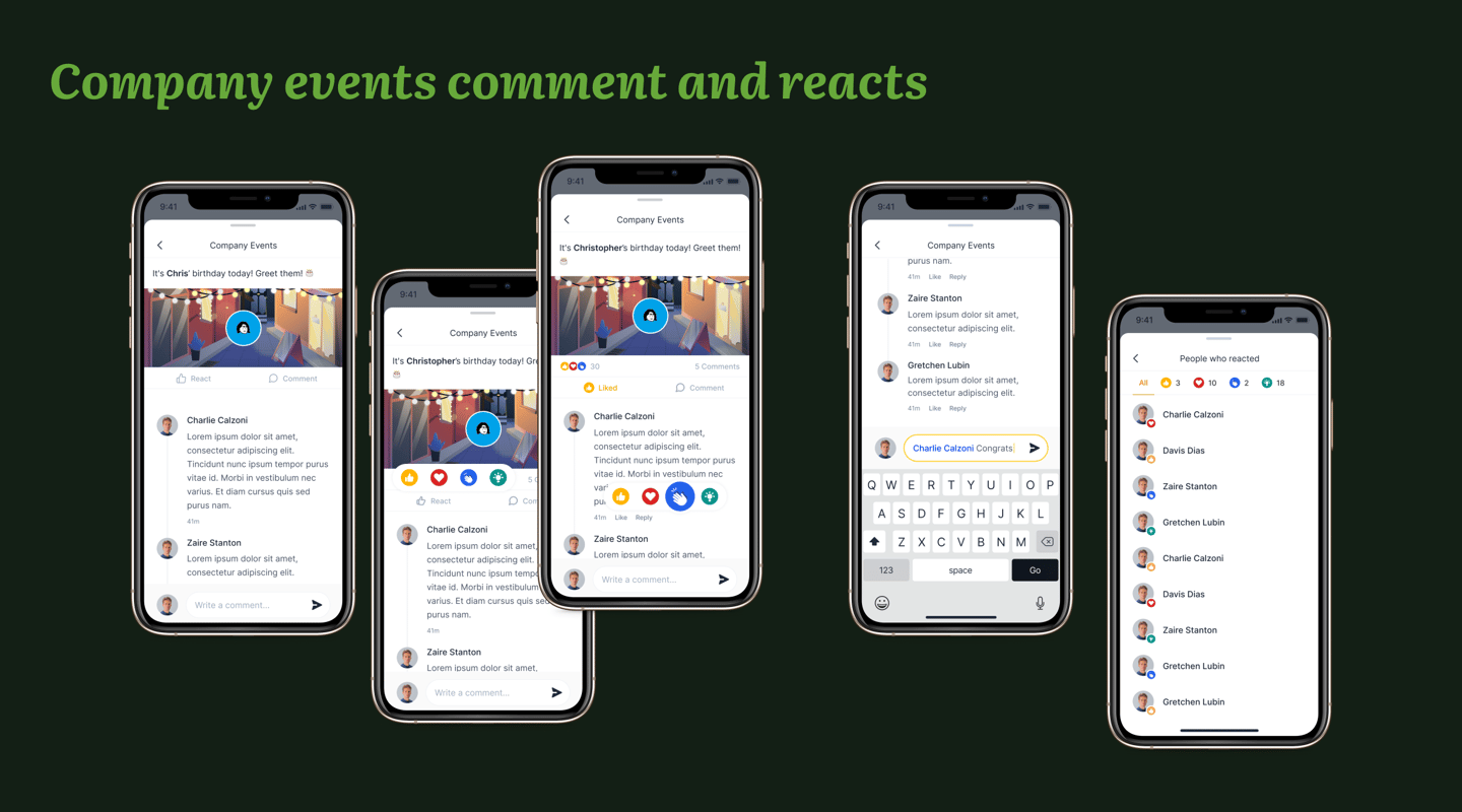

Please note: In compliance with the Non-Disclosure Agreement terms set forth by the company, I am limited to displaying only selected screens from this project. Confidentiality and adherence to the NDA terms are strictly maintained.
Feel free to reach out!
I am available for a FREE online 1-1 mentorship.
Go to www.adplist.org/mentors/estella to book a 30-minute session with me.
I am also open to event speaking engagements with the following topics:
UX Design
Typography
Design System
Design Management
Brand Identity Design
Career Progression in Design
Women Empowerment topics
Inquire about speaking availability by sending me a message on LinkedIn.
